
Shopify stores designed and launched
Mobile first Shopify responsive redesign
Shopify Mobile Optimization Through a Mobile-First Responsive Redesign
Shopify mobile optimization for stores whose phone visitors browse, squint, pinch and leave. We rebuild your home, collection, product and cart templates around thumbs and small screens first, then scale them up cleanly for tablet and desktop, from $790. Track record: over 450 launches since 2015 and a 4.9+ rating from verified clients.
- Thumb-reach layouts, sticky buy bar and readable type
- Separate mobile and desktop artwork where it matters
- Every template checked at phone, tablet and desktop widths
- Set-scope packages plus a price calculator that updates live
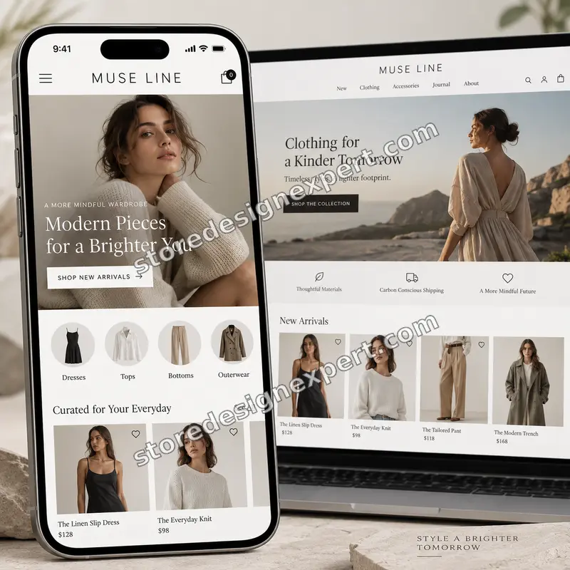
Our track record
Over 450 Shopify Stores Launched Since 2015. Let Us Make Yours Feel Native on a Phone.
Phone screens punish every sloppy margin, oversized image and tiny button. We have shipped enough storefronts to know which fixes lift a mobile visit into a purchase, and we apply them with the discipline of a team that has done it 450 times.
Average rating from verified clients
Building Shopify stores since
Secure checkout
Pay through a protected checkout and keep a full order record.
Two revision rounds
Included in every package, so the result matches what you pictured.
Backup before changes
We work on a duplicate of your theme, never on your live store.
Who this is for
Made for Stores Where Most Visitors Arrive on a Phone
Plenty of themes call themselves responsive and still feel awkward in one hand. These are the situations in which owners come to us, and what each of them usually needs first.
You are a good fit if
- Most of your sessions come from phones
- Your pages feel cramped or clumsy in one hand
- You want a fixed cost before work starts
- You need changes made safely, away from the live theme
Owners whose phone sales lag behind desktop
Traffic is healthy but small-screen visitors rarely check out. You need the buying path rebuilt for one thumb, not squeezed down from a wide layout.
Brands with a heavily customised old theme
Years of patches left spacing that breaks at odd widths. A tidy mobile-first pass on a duplicate theme is safer than adding another patch.
Photography and fashion stores
Wide lifestyle banners crop faces and products on narrow screens. Art-directed mobile crops keep the subject visible and the headline legible.
Large catalogs with deep menus
Hundreds of collections turn the hamburger drawer into a maze. We restructure the drawer, search and filters so shoppers reach products in a few taps.
Stores just moved to a new theme
The new theme looks fine on a laptop, then the real orders arrive from phones. We tune the unfamiliar layout before the habits of your audience expose it.
Teams preparing for a campaign
Paid social sends people straight to mobile product pages. We make sure those pages load fast, read clearly and offer a button within reach before spend ramps up.
Problems solved
Why Phone Visitors Leave Even When Your Shopify Mobile View Looks Fine on Desktop
Checking a store by shrinking a browser window hides most small-screen faults. These are the problems we find over and over when we open a store on actual phones, and how each is resolved.
Buttons and links sit too close together.
Outcome: We enlarge tap targets to comfortable finger size and add spacing between neighbours, so a shopper hits the right option the first time.
Banners crop badly and headlines vanish.
Outcome: We prepare dedicated mobile crops and text placement, so the offer stays readable instead of hiding behind a cropped model.
Type is either microscopic or shouts.
Outcome: Heading, body and price sizes are set on a mobile scale first, then enlarged for wider screens, which keeps reading comfortable at every width.
The add-to-cart button scrolls out of sight.
Outcome: A sticky buy bar keeps the main action in thumb reach on long product pages, with variant choice and price visible beside it.
Oversized images make pages crawl over cellular data.
Outcome: We serve properly sized, responsive images and lazy-load whatever sits below the first screen, so the first view arrives quickly.
Filters, tables and forms overflow the screen.
Outcome: Wide elements are restructured into stacked, scrollable or collapsible patterns, so nothing forces sideways scrolling or pinch-zoom.
What we can do
What Our Shopify Responsive Design Work Covers, Template by Template
Good Shopify responsive design is a set of many small decisions that add up. These are the six areas where our mobile-first rebuild spends its hours.
Thumb-zone layouts for the buying path
We map where a thumb naturally lands and move primary actions there. Add to cart, variant pickers, quantity and the checkout button are placed so they can be used one-handed on a larger phone.
Section-level rebuild in Online Store 2.0
Layouts are adjusted inside theme sections and blocks, with mobile settings you can edit in the theme editor. Future changes stay possible without a developer for each tweak.
Art-directed mobile imagery
A Shopify mobile and desktop banner should not be one cropped file. We prepare separate focal points or images per breakpoint, and set the code to load the right one.
Navigation, search and filters on small screens
We design the mobile drawer, predictive search and collection filters as one system, with sensible depth, clear back steps and sticky controls.
Performance that suits mobile networks
Responsive image sizes, deferred scripts and trimmed layout shift keep the phone experience quick. We target Google's published thresholds for loading, interaction and visual stability.
Testing across the widths people actually use
We review small phone, large phone, tablet portrait and landscape, laptop and wide desktop, in real browsers, and fix the awkward in-between sizes that emulators hide.
What is included
What Your Shopify Mobile Optimization Project Includes
The work is divided into six streams so you can see where the hours go. The comparison table further down shows how each stream scales across the three packages.
Mobile audit
- Walkthrough of your store on real phones and tablets
- Written list of the faults found, ranked by impact
- Review of your current theme's mobile settings
- Agreed scope signed off before any change is made
Template rebuild
- Home, collection, product and cart templates reworked for mobile first
- Spacing, type scale and grid reset on a mobile scale
- Section settings made editable for phone and desktop
- Custom mobile sections in Full Reflow
Imagery and banners
- Separate mobile crops for hero and campaign banners
- Responsive image sizes set in the theme code
- Product gallery swipe, zoom and thumbnail behaviour tuned
- Lazy-loading for everything below the first screen
Navigation and tap targets
- Mobile drawer menu rebuilt with clear depth and back steps
- Search placement and predictive results tuned
- Tap targets enlarged and spaced
- Sticky add-to-cart bar on product pages
Speed and stability
- Image weight and format review
- Deferred loading for non-critical scripts
- Layout shift fixes for banners, fonts and app blocks
- Before and after mobile speed readings shared
Testing and handover
- Phone, tablet and desktop checks on real browsers
- Backup copy of your current theme before any change
- Recorded walkthrough and written notes on mobile settings
- Two rounds of revisions after your review
Most of the value hides in the checks and the in-between widths, so testing and handover appear as deliverables here rather than as a closing remark.
See how it works
A Sticky Buy Bar Built for the Thumb Zone
Phone shoppers scroll a long way down a product page, and every inch of scrolling is a chance to forget the button. This walkthrough shows how a product page gets a sticky purchase bar, a swipeable size picker and clear tap targets so the Shopify mobile version works with one hand.
Portfolio
Shopify Storefront Designs by Niche
A look at store designs across fashion, home, beauty, pets and gifts, to show the standard of layout and finish behind Mobile-First Shopify Responsive Redesign.

Beauty store design
Beauty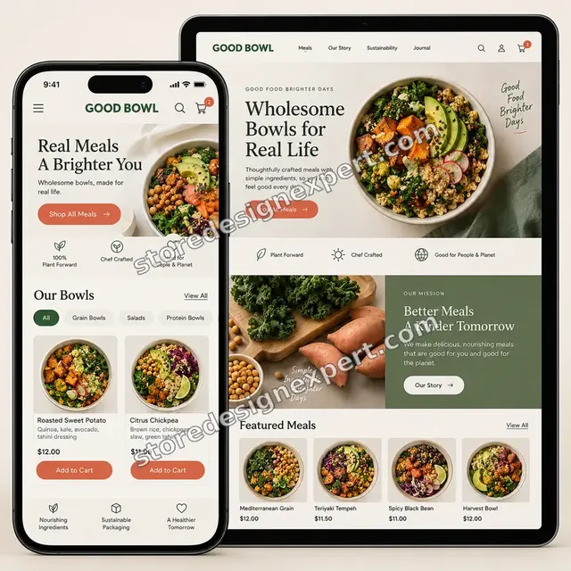
Food store design
Food
Outdoor store design
OutdoorProcess and timeline
Our Mobile-First Redesign Process and Timeline
The project moves through six stages, and all changes are made in a duplicate theme so your live store keeps taking orders. Tap Ready usually lands in 4 to 6 working days, while the calculator shows how options stretch the schedule.
- 01
Phone-first audit
We open your store on actual phones and a tablet, record what feels wrong and rank each fault by its effect on buying. You receive the list with an agreed scope.
- 02
Mobile layout plan
Spacing, type scale, grid and the position of key actions are set for the narrowest screen first. You approve a short plan before the build starts.
- 03
Build in a duplicate theme
We rework the sections, styles and templates in a copy of your theme, so every change can be reviewed on a preview link without touching what customers see.
- 04
Imagery and banners
Mobile crops and responsive sizes are prepared and wired in, so each campaign image keeps its subject and its text readable on a small screen.
- 05
Device testing
We step through the buying path on phones, a tablet and desktop, resize through the awkward in-between widths and correct whatever breaks. Your review rounds follow.
- 06
Publish and hand over
Once you approve, we publish the new theme, keep the old one as a rollback, and send a recorded walkthrough and notes on the mobile settings.
Compare your options
Theme Settings, App, Freelance Gig or a Mobile-First Redesign by Store Design Expert?
There are four common ways to fix a weak phone experience. Changing settings costs the least, apps add features, a gig is cheap and varies, and a specialist rebuild is the most complete. Compare them on what you actually get.
| What matters | Theme settings | Mobile app plugin | Freelance gig | Store Design Expert |
|---|---|---|---|---|
| Tap targets and spacing reworked | Limited | No | Varies | Yes |
| Separate mobile and desktop banners | Sometimes | No | Varies | Yes |
| Sticky add-to-cart and drawer rebuild | No | App only | Varies | Yes |
| Built in a duplicate theme | You do it | No | Rarely | Yes |
| Tested on real phones and tablets | You do it | No | Rarely | Yes |
| Speed readings before and after | No | Some apps | Rarely | Yes |
| Recorded handover and notes | No | No | Rarely | Yes |
| Fixed price up front | Yes | Monthly fee | Varies | Yes |
Inside every project
What Keeps Your Live Store Safe While We Rework It
Changing layouts on a store that is taking orders carries risk. These safeguards are part of every project, and they explain why a fixed price is realistic for this kind of work.
We edit a copy, not your live theme
The rebuild lives in a copy. Customers keep seeing and buying from the current theme until you have approved the new one on a preview link.
Collaborator access, nothing shared
We work through Shopify's collaborator permissions limited to what the project needs. Your owner credentials stay with you, and access can be withdrawn the moment we finish.
A written device checklist
Every template is checked at the same list of widths and tasks, from opening the menu to completing a test order, and the results are logged.
Rollback ready on launch day
The previous theme stays in your library after publishing. If anything surprising appears, switching back takes a click rather than a developer.
Updates at fixed checkpoints
You hear from us after the audit, when the build is ready for review and when testing finishes, so you never chase for news.
Fixed scope and two revision rounds
The price covers the scope shown, including two rounds of changes after your review, so the end result matches the plan you approved.
Interactive price calculator
Build Your Shopify Mobile Optimization Package
Pick a package, tell us how many templates are in play, how you want to approach the theme and how deep the testing should go, then choose your speed. The fixed price and timeline refresh with every click.
Request a custom quote
Shopify Plus checkout changes, a full custom theme build, headless storefronts, native app work or stores with more than 60 template variants receive a custom quote with a written scope.
Request a QuoteChanged your mind? Choose Tap Ready, Pocketfront or Full Reflow above to return to the instant calculator.
Packages and comparison
Compare Mobile Optimization Packages Side by Side
Each line in this table is something you can hold us to. Your final price depends on templates, theme approach and testing depth, which the calculator above totals in real time.
| What is included | Tap Ready $790 | Pocketfront $1,390Recommended | Full Reflow $2,290 |
|---|---|---|---|
| Mobile walkthrough audit | Included | Included | Included |
| Home and collection reworked | Included | Included | Included |
| Product and cart reworked | Included | Included | Included |
| Tap targets and type scale reset | Included | Included | Included |
| Backup of your current theme | Included | Included | Included |
| Recorded handover and two revision rounds | Included | Included | Included |
| Mobile drawer and search rebuilt | Not included | Included | Included |
| Art-directed mobile banners | Not included | Included | Included |
| Sticky add-to-cart bar | Not included | Included | Included |
| Before and after speed readings | Not included | Included | Included |
| Custom mobile-first sections | Not included | Not included | Included |
| Tablet portrait and landscape pass | Not included | Not included | Included |
| Accessibility checks on tap and focus | Not included | Not included | Included |
| 14 days of fixes | Not included | Not included | Included |
| Typical delivery | 4 to 6 days | 7 to 10 days | 10 to 14 days |
The calculator above gives the exact price and delivery estimate for your Mobile-First Shopify Responsive Redesign order, and that is what you pay.
Why Store Design Expert
Shopify Web Design Services From a Team That Only Works on Shopify
Specialisation matters on small screens, where a platform quirk can ruin a layout. Here is how working with us differs from a general web studio or a quick gig.
Shopify only, since 2015
We spend our days inside theme code, sections and the editor. That experience shows when a layout needs to bend gracefully across widths.
A phone is our starting point
We design the narrow screen first, so the page is never an afterthought of a desktop layout shrunk to fit.
A Shopify website design agency without the retainer
You buy a defined project with a fixed price. There is no hourly meter and nothing to cancel once the work is delivered.
We test what customers actually do
Opening menus, picking variants and paying are checked on devices, because that is where mobile faults reveal themselves.
Priced for the work, not the overhead
Our packages sit above marketplace gig floors because testing and handover are included, and well under agency redesign quotes.
You keep the theme and the data
Everything remains in your Shopify account, and any store we build in our Partner account is transferred to you at the end.
What we need to get started
What We Need From You to Start Your Mobile Redesign
You do not need a design brief. We need a way into the store, a view of how your customers browse and a few decisions.
Add us as a collaborator
If your store exists, send the address and approve our collaborator request in your admin. You remain the owner, no password moves and you can remove us any time.
Rebuilding a brand-new store
Without a live store we start in our own Partner account with a development store. At the end we transfer ownership to you, so picking a plan is your final step.
Or send a staff login
A staff account works if that is easier for you. We suggest collaborator access because it is simpler to revoke, but either route is fine.
Analytics access
Share read access to your Shopify reports or analytics so we can see which devices and pages bring your visitors and where they drop away.
Brand images and banners
Send original, uncompressed artwork for hero banners and campaigns, with any text that must appear, so we can crop and arrange it properly for phones.
Priorities and an approver
Tell us which pages matter most and who approves changes, so we can focus effort where it pays and avoid review loops.
Your owner password and payment cards are things we do not request. All edits happen in a copy of your theme, and you receive written notes at the end.
Testimonials
What Store Owners Say Before You Order Mobile-First Shopify Responsive Redesign
Verified clients describe their experience with Store Design Expert on redesigns, theme work and fixes.
Verified
Store Design Expert delivered an outstanding website development experience! Their professionalism and attention to detail exceeded my expectations, and their proactive communication kept everything running smoothly. Truly impressed by their deep understanding and dedication.
WG
Warren G.United States
Verified
A pleasure to work with. They did pretty much everything I asked and definitely exceeded my expectations. I will be working with Store Design Expert again soon.
JL
Jerry L.United States
Verified
Superb work! Store Design Expert is incredibly patient, and even when I did not fully understand my own questions, everything was explained again in detail. My vision was implemented perfectly, and the work is worth every cent I spent.
KB
Katrin B.Germany
Verified
Very impressed with the build-out. My store is ready to get started, and I am sure I will reach out for edits down the road, but this is everything I could ask for to get the party started. Thanks again, and I will be in touch for future projects.
DH
Dale H.United States
Verified
Very quick and detailed work! Store Design Expert does exactly what you want, in a very professional manner.
LF
Lena F.Germany
Verified
Store Design Expert did an outstanding job with top-notch professionalism on my website project. Everything was delivered quickly without compromising quality. I could not have asked for better!
JM
Jason M.United States
Verified
The website development work was nothing short of professional, with top-notch quality. Their exceptional level of cooperation made the collaboration seamless and enjoyable. Highly recommend working with Store Design Expert!
JC
Jeremy C.United States
Verified
Super great to work with, and super fair!
RO
Robert O.United States
Verified
The website development work was truly impressive. Their attention to detail and ability to exceed expectations made the project a success. Working with them was a breeze, thanks to quick responsiveness and a willingness to go above and beyond.
KD
Kevin D.United States
Related searches
What People Search For Before Ordering Mobile-First Shopify Responsive Redesign
People describe Mobile-First Shopify Responsive Redesign in different ways when they search. These are the common ones.
If you searched for “mobile first shopify responsive redesign”, “shopify responsive design”, “how to make shopify store mobile friendly” or “shopify mobile view”, Mobile-First Shopify Responsive Redesign is the work that answers it.
People who look up “how to fix mobile view on shopify”, “shopify mobile version”, “shopify mobile website” or “how to optimize shopify store for mobile” usually want Mobile-First Shopify Responsive Redesign; the calculator above shows the price and delivery estimate before you commit.
If you searched for “mobile first design vs responsive design”, “which shopify theme is the most responsive” or “shopify mobile and desktop banner”, Mobile-First Shopify Responsive Redesign is the work that answers it.
Owners also search for “shopify web design services”, “shopify website design agency”, “shopify hire an expert” or “shopify developer near me”.
FAQ
Shopify Mobile Optimization FAQs
Answers on cost, timing, theme choices, access and what happens after we publish.
How much does Shopify mobile optimization cost?
Packages start at $790 for Tap Ready, $1,390 for Pocketfront and $2,290 for Full Reflow. Template count, theme approach and testing depth add their own prices, so most complete projects land between about $1,700 and $3,800. The calculator shows your exact fixed figure before you pay.
How to make Shopify store mobile friendly if my theme is already responsive?
A responsive theme only guarantees that columns reflow. Comfort in the hand is a separate matter: tap size, banner crops, menu depth, sticky actions and image weight. We audit those on real phones and rework the weak spots inside your existing theme.
How to fix mobile view on Shopify when the layout breaks at certain widths?
Odd widths usually come from old custom code, fixed pixel sizes or app blocks that ignore the grid. We reproduce the fault, find the rule responsible in a duplicate theme, correct it and then test the widths either side so the fix does not shift the problem elsewhere.
How to optimize Shopify store for mobile without losing desktop quality?
We design the narrow layout first, then enlarge each section for tablet and desktop using the same settings. Because both views come from one structure, improving the phone version does not weaken the desktop one, and the editor keeps controls for each.
Mobile-first design vs responsive design: which one do I need?
Responsive design makes one layout adapt to many screens. Mobile-first is the planning order: the phone layout is decided first and larger screens add to it. Most stores benefit from both, and our work applies mobile-first thinking to a responsive theme.
Which Shopify theme is the most responsive?
Most current Online Store 2.0 themes reflow well, so the real difference lies in how many mobile settings they expose and how heavy they are. We can recommend a lighter theme if yours holds you back, or keep your theme and fix the layouts.
Can you fix my Shopify mobile and desktop banner so they differ?
Yes. We prepare separate crops, or separate images, for phone and desktop, and set the theme to load each one at the right width. Text is kept inside a safe zone so offers stay legible when the image is cropped.
Do you need access to my live store?
You can approve a collaborator request in Shopify and stay the owner, or send a staff login if you prefer. Without a store, we build in our Partner account and transfer ownership at the end. All changes happen in a duplicate theme.
How long does the redesign take?
Tap Ready takes 4 to 6 working days, Pocketfront 7 to 10 and Full Reflow 10 to 14 before options. Wider page counts, a theme swap or deeper testing add days, which the calculator shows. Faster speed choices shorten the range when you have a campaign date.
Shopify hire an expert: can I hire one for a single template instead of the whole store?
Yes. The calculator starts at four core templates, but you can narrow the scope with the product page deep dive or banner set extras, or ask for a quote for a single template. We scope it in writing first so the price stays fixed.
Do you offer a Shopify developer near me for local work?
We are a remote team and work with stores in many countries, using video walkthroughs and shared preview links instead of site visits. You get the same duplicate-theme process and written notes wherever you are based.
Will the redesign change my SEO or my URLs?
We do not change page addresses or remove content. Mobile-first changes improve layout, image sizes and loading, which suit Google's mobile-first indexing. If a theme swap is chosen, we compare headings and metadata before and after to catch accidental losses.
What happens after Mobile-First Shopify Responsive Redesign is finished?
You receive a recorded walkthrough and written notes on your mobile settings, and Full Reflow includes 14 days of fixes. A 30-day support extra is available if you want a longer window for questions and small adjustments.
Ready when you are
Start Your Shopify Mobile Optimization Today
Pick a package, see your fixed price and timeline, and order a Shopify mobile optimization project from a team that has launched over 450 Shopify stores. Your phone visitors get a store that feels made for them, and you get a rollback copy to keep you safe.
Protected payment · Two rounds of changes · Walkthrough video included