
Shopify stores designed and launched
Shopify quick repair
Fix Shopify Mobile Responsiveness Issue: Stop Losing Phone Shoppers to a Page That Will Not Fit
Searching for how to fix Shopify mobile responsiveness issue? We find the cause, repair it in a safe copy and test real phone widths. From $59, fixed price.
- Cause found on a phone width
- Sideways scroll removed
- Buttons easy to tap
- Three widths tested
From$59
Delivery1 to 4 working days
Revisions2 rounds
Our track record
Over 450 Stores Launched Since 2015. Here Is What That Means for Your Phone Layout Repair.
More than 450 Shopify stores launched since 2015 and a 4.9+ average from verified clients sit behind this task. Your phone layout repair is small in scope and handled with the same planning and testing as our biggest builds.
Average rating from verified clients
Building Shopify stores since
Secure checkout
Pay through a protected checkout and keep a full order record.
Two revision rounds
Included in every package, so the result matches what you pictured.
Backup before changes
We work on a duplicate of your theme, never on your live store.
Problem and result
Fix Shopify Mobile Responsiveness Issue: A Store That Fits the Screen in the Shopper's Hand
Most shoppers visit on a phone. If text is cut off, a button is too small or the page wobbles sideways, they leave without telling you. A mobile fix is judged on a real phone width rather than on how it looks on a desktop.
A store that works on desktop only
On a phone the text runs past the edge, a section is wider than the screen and buttons sit too close together to tap with a thumb.
A store that fits a phone
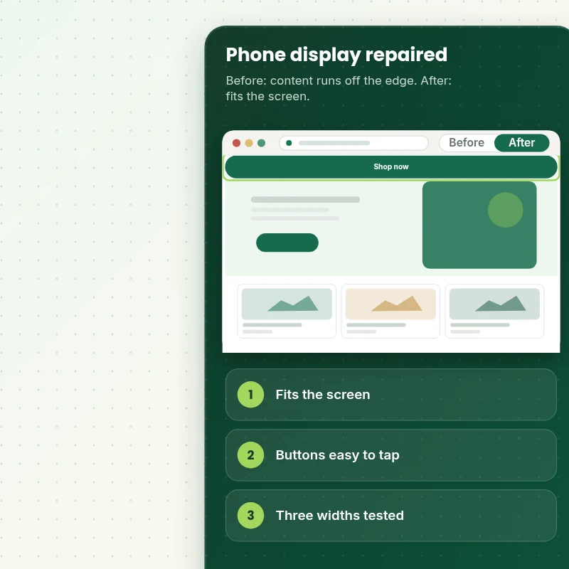
The problem is found and repaired so content fits the screen with no sideways scroll. Buttons are easy to tap and the fix is tested on three phone widths.
What is included
What Your Mobile Display Fix Includes
When you fix a mobile display problem, you get the diagnosis, the repair and tests on real phone widths.
Implementation checklist
- A backup and a duplicate theme taken first
- The problem reproduced on phone widths and a real phone
- The cause traced to fixed widths, large media or injected code
- The repair made with the smallest working change
- Sideways scrolling removed where it exists
- Buttons and links sized for a thumb
- Tests at small, medium and large phone widths
- A short note of the change and how to avoid it
We repair the mobile problems you report, up to the number in your package. A store that needs a rebuilt mobile design is quoted separately, and a fault caused by an app's own code may need that app's fix, which we explain.
See how it works
From a Page That Spills Off the Screen to One That Fits
Follow one fix. We reproduce the problem on a phone width, repair the cause and test small, medium and large screens.
Scope boundaries
Exactly What Is and Is Not Covered for Your Phone Layout Repair
Clear boundaries keep the phone layout repair a fixed-price task, so here is what it covers, what it does not, what we need and when a custom quote is fairer than forcing it into a package.
Included
- Up to three mobile problems repaired
- Tests at three phone widths
- A backup before changes
- Two revision rounds and a short written record
Not included
- A full mobile redesign
- New mobile features
- Building an app
- Changes to the part of checkout that Shopify controls
Access we need
- Collaborator access to your Shopify store
- The page address
- A screenshot and phone model
Quote triggers
- A rebuilt mobile design
- A theme with heavy app code
- Faults on many templates
Typical turnaround
- 1 to 3 working days for most phone layout repair jobs
- Faster options in the calculator
- Timing confirmed before work starts
After launch
- Two revision rounds before go-live
- A short handover note for your phone layout repair
- Questions answered; anything bigger than Fix Mobile Display/Responsiveness Issue quoted as a separate task
Compare your options
Fix Shopify Mobile Responsiveness Issue With Doing It Yourself, an App or a Freelancer?
A phone layout repair can be done in several ways, and this table lines them up on cost, care and what you are left with afterwards.
| What matters | Do it yourself | Marketplace seller | Full-service agency | Store Design Expert |
|---|---|---|---|---|
| Tested on real phone widths | No | No | Sometimes | Yes |
| Cause found, not hidden | No | No | Sometimes | Yes |
| Desktop left unchanged | Sometimes | Sometimes | Sometimes | Yes |
| Change note left behind | No | No | Rarely | Yes |
| Price known before work begins | Free but time-costly | Varies | Quote only | Yes |
| Theme backup before any change | No | Rarely | Usually | Yes |
| Two revision rounds included | No | Varies | Extra cost | Yes |
| Handover note for what changed | No | Rarely | Sometimes | Yes |
Price calculator
Price Your Phone Layout Repair
Pick a package, adjust the options for your phone layout repair and set your speed. The fixed price and delivery estimate update with every click, with no hidden fees.
Request a custom quote
A rebuilt mobile design, a theme with heavy app code and faults on many templates are scoped separately and quoted at a fixed price.
Request a QuoteChanged your mind? Choose Phonefit Basic, Phonefit Standard or Phonefit Plus above to return to the instant calculator.
How it works
How We Handle Your Phone Layout Repair, Step by Step
From purchase to handover in six steps, with a duplicate theme and a test pass in the middle, so the phone layout repair never surprises you.
- 1
Purchase
Decide how far you want the phone layout repair to go, pay at checkout and receive a written confirmation of the scope.
- 2
Access
Add us as a collaborator and fill in a few details about the phone layout repair, so your store remains yours throughout.
- 3
Build in a duplicate theme
We make the phone layout repair in a duplicate of your theme, so your live store keeps selling while we work.
- 4
QA
The phone layout repair goes through a device and browser check against our written criteria before it reaches you.
- 5
Handover
Following your approval we release the phone layout repair and leave you with a clear record of the changes.
- 6
Support
We stay available after the phone layout repair goes live, and anything beyond the original scope is quoted before work starts.
Compatibility and QA
Mobile Fix Checks and Acceptance Criteria
Each phone layout repair is tested on actual phones and browsers against the list below before you review it, and the theme backup we keep makes the whole job reversible.
What we test
- FitContent fits the screen with no sideways scroll.
- TapButtons and links can be tapped without touching a neighbour.
- WidthsThe page holds at small, medium and large phone widths.
- DevicesThe phone layout repair is reviewed on current iOS and Android phones, on tablets and on desktop screens of several sizes.
- BrowsersChrome, Safari, Firefox and Edge, each in its current version.
- RegressionThe desktop layout looks unchanged.
Acceptance criteria
- The problem no longer shows on a phone
- The page does not scroll sideways
- Buttons are easy to tap
- Three phone widths pass
- Desktop looks unchanged
What we need to get started
What We Need to Get Fix Mobile Display/Responsiveness Issue Started
Pick the access route that suits you, because whichever one you choose, the phone layout repair is built in a duplicate of your theme and we tell you before anything goes live, so only the items below are needed for it.
Collaborator access
Send your store URL and approve our Shopify collaborator request for the phone layout repair, and you stay the owner, no password is shared and you can remove our access once the work is live.
No store yet? We build it first
A brand-new store is no obstacle, since we complete the phone layout repair in a Partner development store and then transfer ownership to you.
Prefer to share a login?
Sharing a staff login is possible for the phone layout repair, but we lean towards collaborator access since it is quicker to remove afterwards.
Your phone
Tell us the phone make and the browser where you see the problem.
Show us the problem
Send the page address and a screenshot from the phone.
One decision maker
Name one approver for the phone layout repair and revisions stay neatly within the two rounds we include.
For any doubt about how to share access for the phone layout repair, the form after checkout has a box for it and we reply with a recommendation.
Testimonials
What Store Owners Say Before You Order Fix Mobile Display/Responsiveness Issue
Verified feedback from clients who trusted us with their Shopify stores and quick tasks alike.
Verified
Store Design Expert is the best. The work is very professional, they pay close attention to detail and, more importantly, they listen. Their level of cooperation is second to none, and everything was delivered in a very timely manner. I will keep them in mind for future projects.
BN
Barbara N.United States
Verified
Very patient, informative and transparent, and they did exactly what they said they would do. Thanks for all the help!
RO
Raymond O.United States
Verified
Store Design Expert is the only one I use for all things WordPress. They have a high level of understanding, deliver quality work and are easy to deal with.
SC
Scott C.United States
Verified
A pleasure to work with. They did pretty much everything I asked and definitely exceeded my expectations. I will be working with Store Design Expert again soon.
JL
Jerry L.United States
Verified
Superb work! Store Design Expert is incredibly patient, and even when I did not fully understand my own questions, everything was explained again in detail. My vision was implemented perfectly, and the work is worth every cent I spent.
KB
Katrin B.Germany
Verified
Very impressed with the build-out. My store is ready to get started, and I am sure I will reach out for edits down the road, but this is everything I could ask for to get the party started. Thanks again, and I will be in touch for future projects.
DH
Dale H.United States
Verified
Very quick and detailed work! Store Design Expert does exactly what you want, in a very professional manner.
LF
Lena F.Germany
Verified
Store Design Expert did an outstanding job with top-notch professionalism on my website project. Everything was delivered quickly without compromising quality. I could not have asked for better!
JM
Jason M.United States
Verified
The website development work was nothing short of professional, with top-notch quality. Their exceptional level of cooperation made the collaboration seamless and enjoyable. Highly recommend working with Store Design Expert!
JC
Jeremy C.United States
Related searches
Searches That Bring Owners to Fix Mobile Display/Responsiveness Issue
The searches below are the ones that lead people to Fix Mobile Display/Responsiveness Issue.
“how can i fix my mobile display problem”: owners type these when they need Fix Mobile Display/Responsiveness Issue, and the packages above are priced for that job.
FAQ
Fix Shopify Mobile Responsiveness Issue Questions
Straight answers about cost, scope, timing, apps and what we need from you for your phone layout repair.
How do I fix Shopify mobile responsiveness issue, and can you do it for me?
Yes, we do it for you. Packages start at $59. The calculator adds options such as a sideways scroll hunt, a tap target pass, a prevention note and a second phone check, and shows your exact price and delivery estimate.
How long does a mobile fix take?
Usually two to four days.
Is Fix Mobile Display/Responsiveness Issue safe for my live store?
Yes. Because the phone layout repair lives in a theme copy until you approve it, a problem cannot reach shoppers and the original is one click from being restored.
What do you need from me for Fix Mobile Display/Responsiveness Issue?
Store access for us and the page and phone where you see the problem. Where there is no store yet, we build the phone layout repair in a development store of our own and transfer it to you afterwards.
What is the price of Fix Mobile Display/Responsiveness Issue?
Fix Mobile Display/Responsiveness Issue starts at $59. With every option switched on the total reaches $338.
How are the Fix Mobile Display/Responsiveness Issue packages different?
You can choose between Phonefit Basic at $59 (1 to 2 working days), Phonefit Standard at $99 (2 to 3 working days) and Phonefit Plus at $169 (3 to 4 working days) for Fix Mobile Display/Responsiveness Issue.
What is in the Phonefit Basic package of Fix Mobile Display/Responsiveness Issue?
One mobile display problem repaired: text running off screen, buttons too small to tap or a section wider than the phone, checked on real phone widths. It includes: One mobile problem repaired; Checked on phone widths; Tap targets fixed; Backup taken first; Up to three problems. Phonefit Basic costs $59 and takes 1 to 2 working days.
What does the Fix Mobile Display/Responsiveness Issue calculator ask me?
When you order Fix Mobile Display/Responsiveness Issue you pick a package and then answer 3 short questions in the calculator: how many problems (One problem, Up to three problems); walk through key pages (The reported page, Home, collection, product and cart); how soon do you need it live (Standard, Sooner, Fastest).
Which extras can I add to Fix Mobile Display/Responsiveness Issue?
For Fix Mobile Display/Responsiveness Issue you can add Sideways scroll hunt (+$10), Tap target pass (+$10), A prevention note (+$5), A second real phone check (+$10) and Clean up clashing custom code (+$15).
Ready when you are
Fix Shopify Mobile Responsiveness Issue: A Store That Fits Every Phone
Pick your package, see the exact price and delivery estimate and get the mobile problem repaired and tested on real phone widths. If you need a rebuilt mobile design, request a quote and we will scope it with you.
- Fixed price
- Two revision rounds
- Backup before changes