
Shopify stores designed and launched
Mobile conversion rate optimization
Shopify Mobile Conversion Rate Optimization for Stores Whose Phone Visitors Do Not Buy
Shopify mobile conversion rate optimization starts with your own numbers: how phone sessions compare with desktop, where they stall and which template is to blame. We then fix tap targets, page weight, menus, forms and wallets on the pages that matter and test on real handsets, from $790. Behind it sit 450+ launched stores and a 4.9+ rating from verified clients.
- Phone-versus-desktop reading from your own reports
- Fixes aimed at taps, weight, forms and wallets
- Tested on real iPhones and Android handsets
- Three fixed-scope tiers priced in a live calculator
From$790
Delivery4 to 15 working days
Revisions2 rounds
Our track record
Over 450 Shopify Stores Launched Since 2015. Now Let Us Fix the Way Yours Behaves in a Thumb's Reach.
Most traffic reaches a store on a phone, and many themes still treat that screen as a shrunken desktop. We have built enough storefronts to know which phone details quietly decide whether a visit turns into an order.
Average rating from verified clients
Building Shopify stores since
Secure checkout
Pay through a protected checkout and keep a full order record.
Two revision rounds
Included in every package, so the result matches what you pictured.
Backup before changes
We work on a duplicate of your theme, never on your live store.
Who this is for
Who Needs Shopify Mobile Conversion Rate Optimization
A weak phone result has many different causes, and the right fix depends on which one you have. These are the situations in which owners usually reach out to us.
Brands where most visits come from phones but orders do not
Your reports show the majority of sessions on a handset while the sales split leans the other way. That mismatch is the clearest sign that the phone experience, not the product, needs work.
Owners whose Shopify store is not converting and who cannot say why
Desktop looks fine in the theme preview, so nothing seems broken. We open the store on actual phones and find the small things the preview hides.
Stores spending on social and shopping ads
Paid social clicks come mostly from phones. If the landing page loads slowly or hides its button, you pay for every visit that never gets going.
Merchants on an older or heavily edited theme
Years of added apps and pasted snippets leave a phone layout that shifts, overflows or stacks oddly. We tidy it in a copy and keep what works.
Shops that sell on visuals
Large galleries and video heroes look great on a laptop and crawl on a mobile connection. We keep the look and trim the weight.
Teams that tried a new theme and saw no change
A redesign is not the same as a phone-first review. We check what the new theme did to forms, menus and the cart before you buy another.
Problems solved
Why Shopify Mobile Stores Lose Shoppers Before the Cart
Phones remove the room for error that a wide screen allows. These are the failure points we look at first when a store is losing its handset visitors.
The problem
Cramped taps cause mis-taps.
The outcome
Fingers are wider than cursors. Cramped links, tiny close icons and filter chips that overlap cause mis-taps, and every mis-tap is a small reason to give up.
The problem
Heavy pages keep the shopper waiting.
The outcome
Oversized hero images, stacked app scripts and web fonts add seconds on a mobile connection. Google's published target for the main content to appear is 2.5 seconds or less.
The problem
Forms fight the keyboard.
The outcome
Fields that raise the wrong keyboard, skip autofill or sit under a fixed bar force shoppers to type more than they should. Typing is the slowest thing anyone does on a phone.
The problem
The key message lives below the fold.
The outcome
On a narrow screen the first view is small. If price, delivery and the buy button are pushed down by banners and popups, many visitors never scroll to them.
The problem
Popups and chat bubbles cover the page.
The outcome
A newsletter modal, a cookie bar and a chat button can fill half of a small screen at once. We make them take turns and stay out of the way of the purchase buttons.
The problem
Wallet buttons appear too late.
The outcome
Shop Pay, Apple Pay and Google Pay save typing, but only if shoppers meet them early. When they show up only on the last step, a lot of the saving is wasted.
What we can do
What We Can Fix When Phone Shoppers Stall
This is hands-on theme and settings work, not a slide deck. Here are the six areas where a mobile project spends its hours.
Device-level diagnosis
We split Shopify's sessions, conversion and funnel reports by device type and landing page, then compare them with GA4 if you use it. The result is a short list of the templates that carry the most phone sessions and leak the most of them.
Tap targets and thumb zones
We resize buttons, quantity steppers, swatches and close icons to comfortable touch sizes, aiming at Apple's 44 point guidance, and move the main actions into easy reach. Sticky elements are checked so they never cover each other.
Page weight and Core Web Vitals
We review hero media, font loading, app scripts and image sizes against the published thresholds for LCP, INP and CLS. Where an app is the culprit we explain the trade-off and let you decide whether to keep it.
Menus, search and collection browsing
Navigation drawers, search overlays and filter panels are rebuilt for one-handed use. We make sure shoppers can reach a product within a few taps and always get back to where they were.
Shopify mobile checkout optimization settings
We review guest checkout, express wallets, address autofill and the order of payment methods within what the checkout editor allows. Shopify controls the checkout markup, so we focus on settings and the steps before it.
Real-device verification
Changes are tried on physical iPhones and Android handsets in Safari and Chrome, in portrait and landscape, on slow and fast connections. Notes list every device and the result, so you can see what was covered.
What is included
What Your Mobile Conversion Project Includes
The work runs in six streams, and each one ends in something you can open on your own phone. The package table further down shows how much of each stream you receive.
Phone diagnosis
- Sessions and conversion split by device
- Landing pages ranked by phone traffic
- Phone walkthrough of the buying path
- Written list of causes in plain English
Touch and layout
- Tap target and spacing review
- Thumb-zone placement of main buttons
- Sticky bar and widget conflicts resolved
- Horizontal overflow and zoom issues removed
Weight and speed
- Image and video sizing review
- Font loading and script audit
- Core Web Vitals reading before and after
- Heavy apps flagged with alternatives
Menus and browsing
- Mobile menu and search review
- Filter and sort panel rebuilt for thumbs
- Collection card layout tuned for small screens
- Back-navigation behaviour checked
Forms and wallets
- Keyboard types and autofill attributes set
- Express wallet placement reviewed
- Cart and checkout settings aligned
- Error messages written for small screens
Testing and handover
- Duplicate theme made before any edit
- Real-device test sheet with results
- Recorded walkthrough of every change
- Revision rounds, two of them, once you have reviewed
Phone work needs its own checks because a layout that passes on a laptop window can fail on a real screen, so testing has a stream of its own.
See how it works
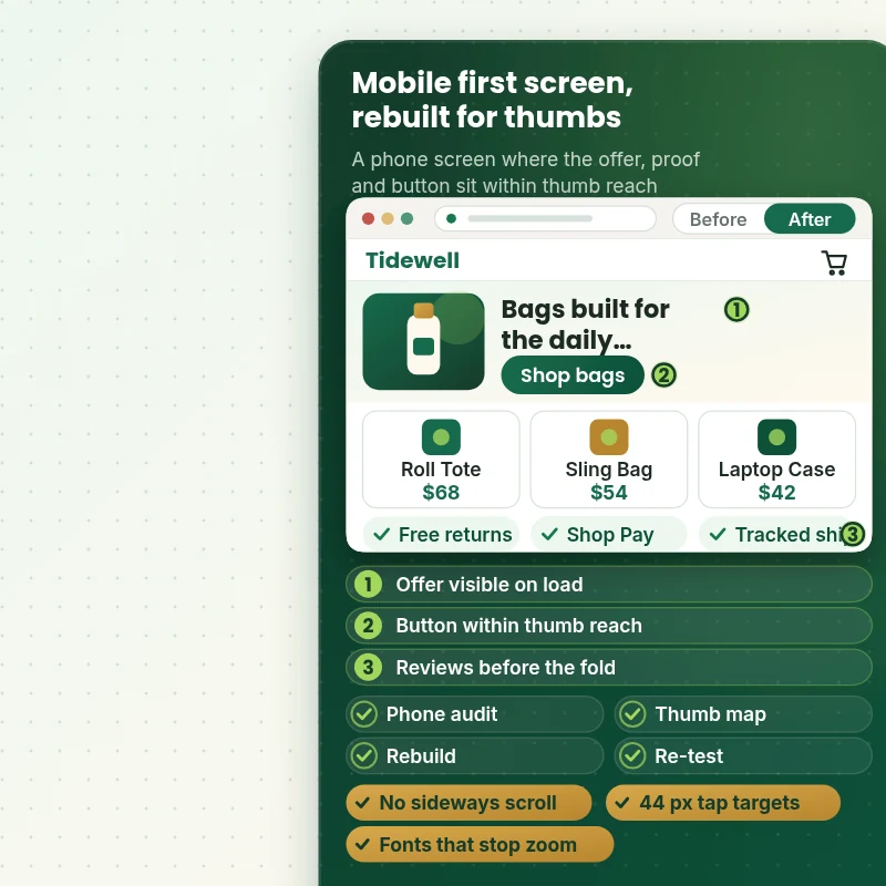
A Phone Screen Rebuilt Around the Thumb
Here is the kind of change a phone-first review makes. The offer is visible on load, the button sits within thumb reach, reassurance appears before the fold and the text is large enough that nobody has to pinch to read it or to focus a field. Slide the divider to compare the before and after views.
Portfolio
Shopify Storefront Designs by Niche
Different niches need different layouts. These store designs show how we shape a storefront around its products, and Shopify Mobile Conversion Rate Optimization follows the same approach.

Fitness technology store design
Fitness technology
Skincare store design
Skincare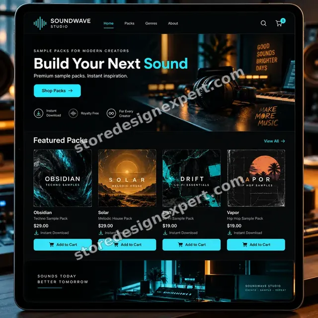
Music samples store design
Music samples
Sleep and recovery store design
Sleep and recovery
Yoga store design
Yoga
Pet creator store design
Pet creatorProcess and timeline
Our Shopify Mobile Conversion Rate Optimization Process and Timeline
Six stages take the project from reading your numbers to a monitored launch. Thumb Test often lands in 4 to 6 working days, and the calculator shows how options stretch it.
- 1
Read the numbers
We open your device reports and funnel, rank the landing pages by phone sessions and note where phone and desktop diverge. That gives the work a starting point built on evidence.
- 2
Walk it on handsets
We shop your store the way a customer would, on physical phones, and record every stumble. The notes include screenshots and the exact steps to reproduce each issue.
- 3
Agree the fix list
Issues are ranked by how many sessions they touch and how safe they are to change. You approve the list, so nothing unexpected reaches the live store.
- 4
Build in a theme copy
Edits go into a duplicate theme with a private preview link. Visitors keep using the live theme while we work.
- 5
Test across devices
We try each change on the agreed phones and browsers, then rerun the Core Web Vitals checks. Anything that misbehaves is fixed before you see it.
- 6
Publish and brief you
After your approval we publish, keep the previous theme as a fallback and send a recording with a reading plan for the weeks after.
Compare your options
Responsive Theme, DIY App, Freelance Gig or Full Mobile CRO Service?
Four routes lead to a better phone experience. Each covers a different slice of the problem, so weigh them against what is actually going wrong on your handset view.
| What matters | Responsive theme only | DIY app stack | Freelance gig | Store Design Expert |
|---|---|---|---|---|
| Phone-versus-desktop data reading | No | You do it | Rarely | Yes |
| Fixes to tap targets and spacing | Partly | No | Varies | Yes |
| Page weight and script review | No | Adds weight | Rarely | Yes |
| Forms, keyboards and wallet placement | No | No | Varies | Yes |
| Tested on real iPhones and Android phones | No | No | Rarely | Yes |
| Edited in a duplicate with the old theme kept | No | No | Rarely | Yes |
| Written test sheet and recorded handover | No | No | Rarely | Yes |
| Fixed price up front | Yes | Monthly fee | Varies | Yes |
Inside every project
How We Keep Your Live Store Safe While We Edit It
Touching the theme that earns your revenue calls for discipline. These safeguards are included in every package and are the reason a fixed price is workable.
Duplicate theme for all edits
Your published theme is never edited directly. Everything is built in a copy, previewed on a private link and swapped in only after you say yes.
Collaborator-level access only
A scoped Shopify collaborator request gives us what we need, and you can remove it the day we finish. We do not need your owner password at any stage.
A written device test sheet
The sheet lists each phone, operating system and browser we used, what we tried and what happened. It is part of your handover, not an internal note.
Fallback theme kept
The previous theme stays in your library after launch. If something odd appears, rolling back takes a couple of clicks.
Updates at fixed points
You hear from us after the diagnosis, when the build is ready to review and when testing is done, each time with screenshots from real handsets.
Honest results reading
We agree before launch how outcomes will be read against your own baseline, and we explain that traffic mix and seasons also move the numbers.
Interactive price calculator
Build Your Mobile Conversion Package
Pick a package, then say which page types, observation method and theme age apply. Totals and delivery dates update as you click, so a fixed figure is in front of you before you pay anything.
Request a custom quote
Headless storefronts, custom checkout extensions on Plus, native app projects or stores with several themes in use are quoted separately after a short scoping chat.
Request a QuoteChanged your mind? Choose Thumb Test, Pocket Rebuild or Handheld Overhaul above to return to the instant calculator.
Packages and comparison
Compare Mobile Conversion Packages Side by Side
Every row is a deliverable you can check. The final price depends on the page scope, observation method and theme age you choose in the calculator.
| What is included | Thumb Test $790 | Pocket Rebuild $1,490Recommended | Handheld Overhaul $2,490 |
|---|---|---|---|
| Device-level report reading | Included | Included | Included |
| Phone walkthrough of the buying path | Included | Included | Included |
| Tap target and spacing fixes | Included | Included | Included |
| Popup and widget overlap clean-up | Included | Included | Included |
| Core Web Vitals reading | Included | Included | Included |
| Recorded handover and two revision rounds | Included | Included | Included |
| Product page phone layout rebuild | Not included | Included | Included |
| Collection filters and cards tuned | Not included | Included | Included |
| Cart view and wallet placement | Not included | Included | Included |
| Real-device test sheet | Not included | Included | Included |
| Menu and search rebuild | Not included | Not included | Included |
| Home page phone layout | Not included | Not included | Included |
| Page weight reduction plan applied | Not included | Not included | Included |
| 30 days of fixes | Not included | Not included | Included |
| Typical delivery | 4 to 6 days | 7 to 10 days | 11 to 15 days |
What the calculator above shows for Shopify Mobile Conversion Rate Optimization, the total and the estimated delivery, is what your order will use.
Why Store Design Expert
Why Stores Pick Us as Their Shopify CRO Agency for Mobile Work
Generic Shopify conversion rate optimization advice usually treats the phone view as a footnote to a desktop redesign. Here is how we approach it differently.
Shopify only since 2015
Our days are spent in themes, Liquid and checkout settings, so we know which levers your plan gives you and which it does not.
Phone first, desktop second
We start from the smallest screen and the slowest connection, then make sure the wider layouts still hold together.
A done-for-you service without a retainer
You buy a bounded project with a stated price and a finish date, not a monthly fee that never ends. That is what a Shopify done for you service should look like.
Evidence over opinion
Reports, recordings and handset tests decide what changes. If the data shows a layout is working, we leave it alone.
Developers and conversion work under one roof
The person who spots a cramped filter chip also writes the fix, so nothing is lost in a hand-off between strategist and coder.
Priced between gigs and retainers
Our packages cost more than a gig because testing and handover are included, and well under one month of a typical CRO retainer.
What we need to get started
What You Hand Us Before Day One
No long brief is required. We need a way into the store, a view of your numbers and a few decisions.
Accept a collaborator request
Send us your store address and approve the Shopify collaborator invitation we issue. Ownership stays with you, and no password is shared.
No live store yet
We can create the store in our own Shopify Partner account and move it over to you once the work is complete, leaving you only the plan choice at the end.
Prefer a staff login
You can instead set up a staff account for us. We lean towards collaborator access because it is simpler for you to cancel later.
Analytics access
Share read access to Shopify reports and, if installed, Google Analytics so we can split sessions and orders by device.
Your own phone habits
Tell us which phones and browsers your customers favour, and anything you have noticed yourself, such as a page that always feels slow.
Priorities and an approver
Name the pages that matter most, any apps that must stay, and the person who signs off changes before they go live.
Card details and owner passwords are not part of the deal. Every edit lives in a theme copy, and notes plus a recording come with the close of the project.
Testimonials
What Store Owners Say Before You Order Shopify Mobile Conversion Rate Optimization
Verified clients describe working with Store Design Expert on builds, fixes and conversion work.
Verified
Store Design Expert delivered an outstanding website development experience! Their professionalism and attention to detail exceeded my expectations, and their proactive communication kept everything running smoothly. Truly impressed by their deep understanding and dedication.
WG
Warren G.United States
Verified
Store Design Expert is the only one I use for all things WordPress. They have a high level of understanding, deliver quality work and are easy to deal with.
SC
Scott C.United States
Verified
A pleasure to work with. They did pretty much everything I asked and definitely exceeded my expectations. I will be working with Store Design Expert again soon.
JL
Jerry L.United States
Verified
Superb work! Store Design Expert is incredibly patient, and even when I did not fully understand my own questions, everything was explained again in detail. My vision was implemented perfectly, and the work is worth every cent I spent.
KB
Katrin B.Germany
Verified
Very impressed with the build-out. My store is ready to get started, and I am sure I will reach out for edits down the road, but this is everything I could ask for to get the party started. Thanks again, and I will be in touch for future projects.
DH
Dale H.United States
Verified
Very quick and detailed work! Store Design Expert does exactly what you want, in a very professional manner.
LF
Lena F.Germany
Verified
Store Design Expert did an outstanding job with top-notch professionalism on my website project. Everything was delivered quickly without compromising quality. I could not have asked for better!
JM
Jason M.United States
Verified
The website development work was nothing short of professional, with top-notch quality. Their exceptional level of cooperation made the collaboration seamless and enjoyable. Highly recommend working with Store Design Expert!
JC
Jeremy C.United States
Verified
Super great to work with, and super fair!
RO
Robert O.United States
Related searches
Related Searches for Shopify Mobile Conversion Rate Optimization
People describe Shopify Mobile Conversion Rate Optimization in different ways when they search. These are the common ones.
“shopify mobile conversion optimization”, “shopify mobile cro”, “shopify mobile checkout optimization” or “fix poor mobile conversion on shopify”: owners type these when they need Shopify Mobile Conversion Rate Optimization, and the packages above are priced for that job.
If you searched for “mobile responsive shopify web design”, “shopify increase conversion rate”, “shopify reviews conversion rate” or “whats a good conversion rate for shopify”, Shopify Mobile Conversion Rate Optimization is the work that answers it.
People who look up “convert shopify store to mobile app free” or “shopify conversion rate optimization” usually want Shopify Mobile Conversion Rate Optimization; the calculator above shows the price and delivery estimate before you commit.
You may also have come across “shopify store not converting”, “shopify cro agency” or “shopify done for you service” while reading about Shopify Mobile Conversion Rate Optimization.
FAQ
Shopify Mobile Conversion Optimization FAQs
Straight answers on price, timing, access, testing and how results are judged.
How much does Shopify mobile conversion rate optimization cost?
Packages start at $790 for Thumb Test, $1,490 for Pocket Rebuild and $2,490 for Handheld Overhaul. Page scope, observation method and theme age add their own prices, so most complete projects land between about $1,100 and $3,600. The calculator shows a fixed total first, and totals above $2,500 use a 50 percent deposit.
What does a Shopify mobile CRO project actually involve?
Shopify mobile CRO here means reading your device-level reports, walking the store on real phones, fixing taps, layouts, weight and forms in a theme copy, and testing the result. You receive a change log, a device test sheet and a recorded walkthrough rather than a slide deck.
Whats a good conversion rate for Shopify mobile stores?
There is no single figure, because product price, traffic source and brand awareness all shift it. Phones almost always convert below desktops, so the useful comparison is your own phone rate against your own desktop rate and against last quarter. We set that baseline before changing anything.
Can you fix poor mobile conversion on Shopify without changing my theme?
Often, yes. Many phone problems come from spacing, page weight, overlapping widgets or settings, which can be repaired in your present theme. If the theme itself is the obstacle we will say so plainly and explain what a replacement would involve before you spend anything.
Shopify store not converting: is mobile the reason?
It may be, and your reports can tell. Compare conversion by device type and landing page. If phone sessions are high and phone orders are low, the handset experience is a prime suspect. If both are weak, the offer, pricing or traffic quality deserves a look too.
Do you do Shopify mobile checkout optimization?
Within the limits Shopify sets, yes. Checkout markup is controlled by Shopify, so we focus on guest checkout, wallets, payment order, shipping display and everything that happens before shoppers reach it. Stores on Plus can also use checkout extensions, which we scope separately.
Is this the same as mobile responsive Shopify web design?
They overlap but differ. Mobile responsive Shopify web design makes a layout adapt to screen sizes. Our work goes further by measuring phone behaviour, repairing what hurts it and testing on handsets. A responsive theme can still convert poorly on a phone.
Can I convert Shopify store to mobile app free instead?
No, and it is rarely the right first step. Apps need installs and upkeep, while a fast mobile site reaches shoppers straight from ads and search. We focus on making the mobile storefront convert. If you later want a native app, we can scope it separately.
How do reviews affect mobile sales?
Reviews help most when they are visible without a long scroll. A star summary near the title and a compact review block lower down are usually enough on a phone. We review how reviews load, because the Shopify reviews conversion rate effect disappears if the widget is slow or broken.
Why hire a Shopify CRO agency instead of installing an app?
Apps add features, but they do not diagnose causes, resolve conflicts between scripts or test on handsets. A Shopify CRO agency does the judging and the verifying. We often keep your apps and simply configure them better, or remove one that is slowing pages.
Will you guarantee a higher conversion rate?
No. Nobody can honestly promise a number, because traffic quality, season, pricing and stock all play a part. What we guarantee is the scope, the testing and the handover. We also agree a reading window and baseline so you can judge the outcome fairly.
What access do you need and how long does it take?
A collaborator request is enough, or a staff login if you prefer, and for a store that does not exist yet we build in our Partner account and transfer ownership. Thumb Test takes 4 to 6 working days, Pocket Rebuild 7 to 10 and Handheld Overhaul 11 to 15 before options.
Shopify increase conversion rate before a sale: can the work be timed?
Yes. Tell us your launch date and we can plan the work to finish ahead of it, using the speed choice in the calculator. We would prioritise the landing pages your ads point to, then the rest of the buying path.
Ready when you are
Start Your Shopify Mobile Conversion Rate Optimization Today
Pick a package, see your fixed price and finish date, and order Shopify mobile conversion rate optimization from a team that has launched more than 450 stores. You receive phone fixes tested on real handsets, a theme copy to fall back on and notes your team can follow.
- Protected payment
- Two rounds of changes
- Walkthrough recording included