
Shopify stores designed and launched
Shopify collection page task
How to Add Columns in Shopify: Fit Your Products to the Screen They Are Seen On
Need to know how to add columns in Shopify the way your design needs, with two, three or four across? We set them per device in a duplicate theme and test every width. From $39, fixed price.
- Two, three or four columns
- Set per desktop, tablet and phone
- Even spacing, no overflow
- Optional shopper switcher
From$39
Delivery1 to 3 working days
Revisions2 rounds
Our track record
450+ Shopify Stores Launched Since 2015. Now Let Us Handle Your Grid Columns.
Store Design Expert has designed and launched more than 450 Shopify stores, and verified clients rate us 4.9+ on average. A grid columns is a small task, so it gets a fixed price, a clear scope and the same checking as a large project.
Average rating from verified clients
Building Shopify stores since
Secure checkout
Pay through a protected checkout and keep a full order record.
Two revision rounds
Included in every package, so the result matches what you pictured.
Backup before changes
We work on a duplicate of your theme, never on your live store.
Problem and result
How to Add Columns in Shopify: Show More Products Without Crowding Them
Too many columns squeeze photos and break prices, and too few waste the screen and make shoppers scroll. The right count differs by device, and it only works if spacing, card text and photo sizes are tuned to each one.
A grid that crowds or wastes space
The theme's default columns do not suit your products, so cards are tiny on a laptop or huge on a phone. Prices wrap, titles collide and shoppers scroll far for little.
A grid set for each device
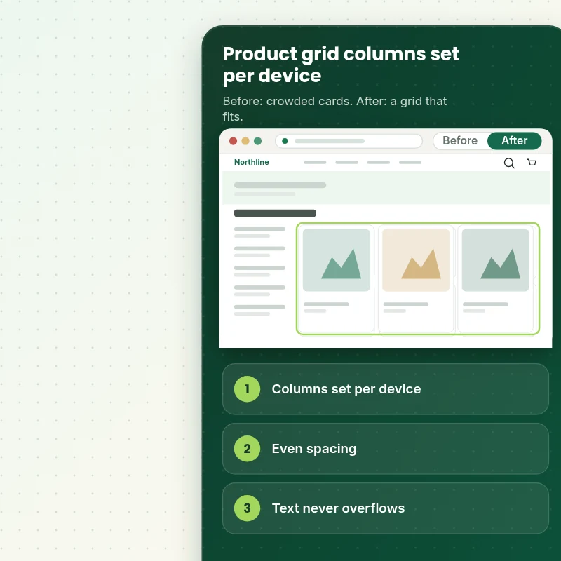
Each screen size shows the number of columns you chose, with even gaps and card text that fits. An optional switcher lets shoppers choose a denser or roomier view.
What is included
What Your Grid Columns Include
When you ask how to change the columns in a Shopify grid, you get counts set per device and spacing tuned so the cards still look right.
Implementation checklist
- The number of columns set for desktop, tablet and phone
- Gaps and card sizes adjusted so rows line up evenly
- Breakpoints chosen where your layout needs them
- Card titles and prices checked so text never overflows
- The same grid applied to collection, search and featured rows, as you choose
- An optional column switcher for shoppers on desktop
- Different counts for chosen collections if you want them
- Handover note showing where each column setting lives
Some themes already have a column setting that we use, while others need small style changes. We change how the grid is laid out and never your product photos, and very different layouts such as masonry or a mixed-size grid are quoted separately.
See how it works
From Default Columns to a Grid Built for Your Products
Follow one visit. The shopper sees four columns on a laptop and two on a phone, with tidy cards at each size.
Scope boundaries
Exactly What Is and Is Not Covered for Your Grid Columns
Know what you are buying: the grid columns covers the items listed here, leaves out the ones that follow and needs only the few things we list.
Included
- Column counts on your live collection templates
- Spacing and breakpoint tuning
- Overflow and width checks
- Handover note plus two revision rounds
Not included
- Masonry or mixed-size grids
- Redesigning product cards
- Resizing product photos
- Any change inside the checkout that Shopify controls
Access we need
- Collaborator access to your Shopify store
- Your column choices per device
- Collections with a different count
Quote triggers
- A masonry or featured-tile grid
- A column count that depends on image shape
- A theme that page builder apps have changed heavily
Typical turnaround
- 1 to 2 working days for most grid columns jobs
- Faster options in the calculator
- Timing confirmed before work starts
After launch
- Two revision rounds before go-live
- A short handover note for your grid columns
- Questions answered; anything bigger than Change Product Grid Columns (2, 3, or 4) quoted as a separate task
Compare your options
How to Add Columns in Shopify With a Theme Setting, an App or a Freelancer?
Here are four ways to get a grid columns done, set side by side on the things that decide whether the result is reliable.
| What matters | Do it yourself | Marketplace seller | Full-service agency | Store Design Expert |
|---|---|---|---|---|
| Set per device | Sometimes | Sometimes | Sometimes | Yes |
| Card text checked at every width | Rarely | Rarely | Sometimes | Yes |
| No monthly fee | Yes | No | Yes | Yes |
| Different counts per collection | No | Sometimes | If coded | Yes |
| Price known before work begins | Free but time-costly | Varies | Quote only | Yes |
| Theme backup before any change | No | Rarely | Usually | Yes |
| Two revision rounds included | No | Varies | Extra cost | Yes |
| Handover note for what changed | No | Rarely | Sometimes | Yes |
Price calculator
Price Your Grid Columns
Pick a package, adjust the options for your grid columns and set your speed. The fixed price and delivery estimate update with every click, with no hidden fees.
Request a custom quote
A masonry or featured-tile grid, column counts that depend on image shape and themes heavily modified by page builder apps are scoped separately and quoted at a fixed price.
Request a QuoteChanged your mind? Choose Gridfit Basic, Gridfit Standard or Gridfit Plus above to return to the instant calculator.
How it works
How We Handle Your Grid Columns, Step by Step
Six stages cover the grid columns end to end, so you always know what is done, what is next and what we need from you.
- 1
Purchase
Order the grid columns by choosing a package and options, and the calculator shows the final price and timing before you pay.
- 2
Access
Give us collaborator access and answer a few questions, and your store stays yours with no owner password needed for the grid columns.
- 3
Build in a duplicate theme
Work on the grid columns happens in a copy of your theme, never on the version shoppers see.
- 4
QA
The grid columns goes through a device and browser check against our written criteria before it reaches you.
- 5
Handover
When you approve the grid columns we move it to the live theme and give you a plain summary of what was done.
- 6
Support
Support does not end at handover, so questions on the grid columns are welcome and new requests get a clear quote.
Compatibility and QA
Grid Column Checks and Acceptance Criteria
Before the grid columns reaches you it is verified against the checks below, and your original theme stays safely backed up, which makes every step reversible.
What we test
- CountsEach device width shows the column count you chose.
- SpacingGaps and rows line up evenly, with no orphan cards.
- TextTitles and prices fit the narrowest column without overflow.
- DevicesTesting for the grid columns covers small phones, large phones, tablets and desktops, so nothing breaks at an in-between width.
- BrowsersThe current versions of Chrome, Safari, Firefox and Edge.
- SwitchWhere a switcher is used, the choice is remembered on reload.
Acceptance criteria
- Each device shows the chosen column count
- Spacing is even
- Card text does not overflow
- The grid is comfortable on small phones
- The handover note shows where each setting lives
What we need to get started
What We Need to Get Change Product Grid Columns (2, 3, or 4) Started
Three ways to give access, then a short list of facts about the grid columns, which is built in a duplicate theme first whichever route you choose, with nothing live until you approve.
Collaborator access
To start the grid columns, send the store address and accept our collaborator invitation, which keeps ownership with you and lets you cut access off at any time.
No store yet? We build it first
With no store yet, we set one up in our Partner account, build the grid columns there and transfer ownership to you, so the only thing left for you is choosing a plan.
Prefer to share a login?
A staff account is an option for the grid columns too, although collaborator access is easier to remove later, so we suggest it first.
Column counts
Tell us how many columns you want on desktop, tablet and phone.
Exceptions
List any collections that need a different layout.
One decision maker
A single decision maker for the grid columns, so comments arrive together and fit the two included rounds.
Should you be unsure which access route works for the grid columns, mention it in the form after checkout and we will advise you.
Testimonials
What Store Owners Say Before You Order Change Product Grid Columns (2, 3, or 4)
Verified feedback from clients who trusted us with their Shopify stores and quick tasks alike.
Verified
Store Design Expert is the best. The work is very professional, they pay close attention to detail and, more importantly, they listen. Their level of cooperation is second to none, and everything was delivered in a very timely manner. I will keep them in mind for future projects.
BN
Barbara N.United States
Verified
I am beyond satisfied! Store Design Expert went above and beyond on my project. Highly recommended!
MD
Michael D.United States
Verified
The experience was tailored to my brand and specifications to the letter. I love the result.
EP
Eric P.United States
Verified
They definitely get the job done. Very patient and understanding throughout the whole project.
BS
Brian S.United States
Verified
Thank you so much to Store Design Expert and the team. My site looks far more appealing to customers, and I will happily recommend your services to other new small businesses.
JS
Jennifer S.United States
Verified
Very patient, informative and transparent, and they did exactly what they said they would do. Thanks for all the help!
RO
Raymond O.United States
Verified
Store Design Expert is the only one I use for all things WordPress. They have a high level of understanding, deliver quality work and are easy to deal with.
SC
Scott C.United States
Verified
A pleasure to work with. They did pretty much everything I asked and definitely exceeded my expectations. I will be working with Store Design Expert again soon.
JL
Jerry L.United States
Verified
Superb work! Store Design Expert is incredibly patient, and even when I did not fully understand my own questions, everything was explained again in detail. My vision was implemented perfectly, and the work is worth every cent I spent.
KB
Katrin B.Germany
Related searches
Related Searches for Change Product Grid Columns (2, 3, or 4)
People describe Change Product Grid Columns (2, 3, or 4) in different ways when they search. These are the common ones.
If you searched for “change product grid columns 2 3 or 4 on shopify” or “shopify liquid force set collection as grid”, Change Product Grid Columns (2, 3, or 4) is the work that answers it.
FAQ
How to Add Columns in Shopify Questions
Straight answers about cost, scope, timing, apps and what we need from you for your grid columns.
Can you show me how to add columns in Shopify the way I want, or do it for me?
Yes, we do it for you. Packages start at $39. The calculator adds options such as a shopper switcher, custom gaps, a wider first row and a card text check, and shows your exact price and delivery estimate before checkout.
What delivery time should I expect for the grid columns?
From access to handover a grid columns usually takes 1 to 3 working days, so if you are working to a deadline choose Sooner or Fastest in the calculator.
Is Change Product Grid Columns (2, 3, or 4) safe for my live store?
Yes. The grid columns is prepared away from your live theme, reviewed by you first and released only on your approval, with the old theme kept safe.
What do you need from me for Change Product Grid Columns (2, 3, or 4)?
Collaborator access to your store and your column counts. Should the store not exist yet, we prepare the grid columns inside our Partner account and then pass the finished store to you.
How much does Change Product Grid Columns (2, 3, or 4) cost?
Change Product Grid Columns (2, 3, or 4) starts at $39. With every option switched on the total reaches $260.
How are the Change Product Grid Columns (2, 3, or 4) packages different?
You can choose between Gridfit Basic at $39 (1 working day), Gridfit Standard at $69 (1 to 2 working days) and Gridfit Plus at $119 (2 to 3 working days) for Change Product Grid Columns (2, 3, or 4).
What do I get with Gridfit Basic for Change Product Grid Columns (2, 3, or 4)?
The number of product columns set for desktop, tablet and phone, such as four, three and two, with even spacing and card sizes. It includes: Columns set per device; Even spacing and card sizes; Applies to every collection; Desktop and mobile tested; Column switcher for shoppers. Gridfit Basic costs $39 and takes 1 working day.
What does the Change Product Grid Columns (2, 3, or 4) calculator ask me?
When you order Change Product Grid Columns (2, 3, or 4) you pick a package and then answer 3 short questions in the calculator: how many device sizes (Desktop and phone, Desktop, tablet and phone); which collections (All collections the same, Different counts on chosen collections); how soon do you need it live (Standard, Sooner, Fastest).
What can I add on top of Change Product Grid Columns (2, 3, or 4)?
Extras available with Change Product Grid Columns (2, 3, or 4): Column switcher for shoppers (+$25), Custom gap and card padding (+$5), Wider first row for featured items (+$15), Card text fit check (+$10) and Fix a grid that breaks at one width (+$15).
Ready when you are
How to Add Columns in Shopify: Let the Grid Fit the Screen
Pick your package, see the exact price and delivery estimate and get a grid with the right number of columns and tidy cards on every device. If you need a masonry grid or counts that depend on image shape, request a quote and we will scope it with you.
Fixed price · Two revision rounds · Backup before changes