
Shopify stores designed and launched
Colours chosen for the brand, tested for readability, applied to the store
Color Palettes for Branding: Colours With a Job to Do, Not Just a Nice Look
A palette must look right and read well. For color palettes for branding we pick colours for your feeling and market, test text and buttons for contrast and apply them to your theme. From $190, fixed price.
- Primary, supporting, neutral and accent tones
- Contrast checked for text and buttons
- Roles and proportions written down
- Applied to your Shopify theme settings
From$190
Delivery2 to 11 working days
Revisions2 rounds
Our track record
450+ Shopify Stores Built Since 2015. Here Is What That Means for Colour Palette.
Colour does more work than any other design choice: it signals who you are and tells shoppers where to click. We choose colours deliberately and prove they are readable before they go anywhere.
Average rating from verified clients
Building Shopify stores since
Secure checkout
Pay through a protected checkout and keep a full order record.
Two revision rounds
Included in every package, so the result matches what you pictured.
Backup before changes
We work on a duplicate of your theme, never on your live store.
Who this is for
Color Palettes for Branding: Who We Work For
Palette work comes up at different moments. Here are the six situations that bring owners to brand colour palette design.
You are a good fit if
- You need or want to improve your brand colours
- You would like the price fixed and the scope written down
- You can describe your brand feeling and share examples you like
- You own the store and approve the final colours
Founders choosing brand colours
Nothing is decided and everything depends on it.
Owners refreshing a tired palette
The old colours feel dated or harsh.
Stores with unreadable buttons or text
Contrast was never checked.
Sellers with theme default colours
The store looks like every other install.
Brands preparing packaging
Print needs exact colour values.
Founders short on time
You would rather answer a brief and receive a tested palette.
Problems solved
Why Colour Choices Go Wrong in Stores
Colours chosen by taste alone often fail on the screen. The six problems below are what owners tell us most.
- Text is hard to read.
Light grey sits on a white background.
- Buttons do not stand out.
The call to action blends with the page.
- Too many colours compete.
No colour has a defined role.
- Colours look different in print.
Packaging does not match the screen.
- The store ignores the brand.
Theme defaults stay in place.
- Nobody has the codes.
Each designer approximates by eye.
What we can do
Color Palettes for Branding: What the Work Covers
Six jobs make up the palette work. Your package decides how far each one goes for your brand colours.
Feeling and market review
We agree what the colours should say and look at your competitors' choices.
Palette design
A primary, supporting, neutral and accent set is chosen and refined.
Contrast and accessibility
Text and button pairs are tested against recognised contrast guidance.
Roles and proportions
Each colour is given a job and a share of the layout.
Print values
Colour values for packaging and print are specified.
Theme application
The palette is entered in your theme's colour settings.
What is included
What Is Inside Your Colour Palette Package
Six groups cover every deliverable in Brand Colour Palette Design. The comparison table below shows how far each group goes by package for colour palette.
Review
- Brand feeling questionnaire
- Competitor colour glance
- Reference board
- Direction summary
Palette
- Primary colour
- Supporting colours
- Neutral set
- Accent colour
Contrast
- Text and background pairs
- Button states
- Link colours
- Alert colours
Rules
- Role per colour
- Proportion guide
- Do and avoid examples
- One-page palette sheet
Print
- Print colour values
- Paper note
- Packaging test
- Spot colour option
Hand-over
- All colour codes
- Theme settings applied
- Written notes
- Recorded walkthrough
Products, brand assets and sign-off come from you. We handle the colour palette work and the checks.
Palette in use
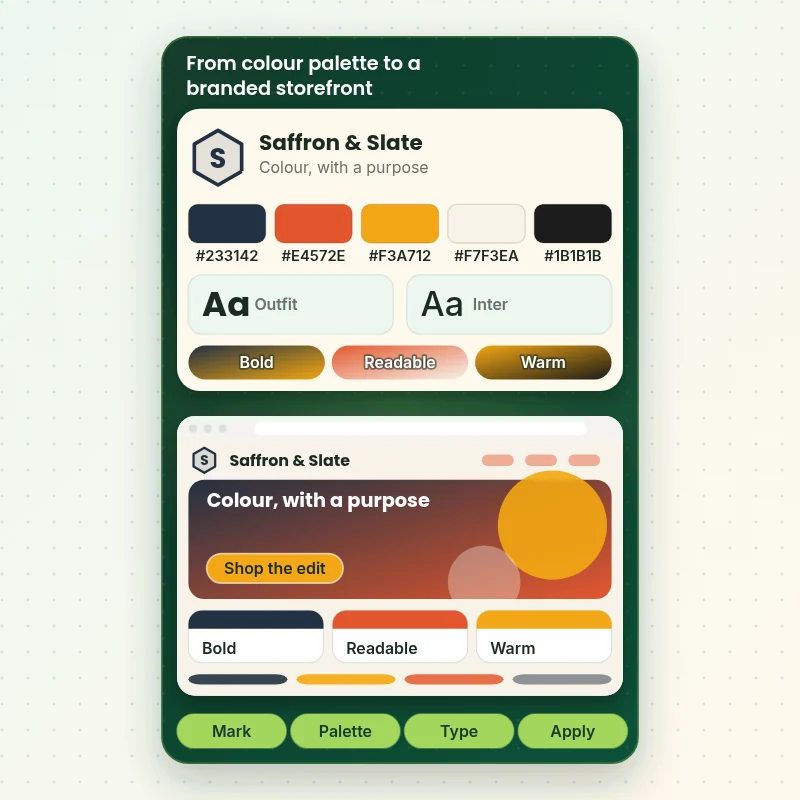
How a Palette Is Applied Across Pages, Buttons and Banners
The walkthrough shows the order we work in: the mark, the palette, the type and then application. Colour is only proven when it works on a button, a banner and a body paragraph, so each is tested in the store.
Portfolio
Shopify Store Designs We Create
A look at store designs across fashion, home, beauty, pets and gifts, to show the standard of layout and finish behind Brand Colour Palette Design.

Restaurant ingredients store design
Restaurant ingredients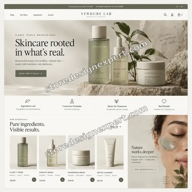
Skincare store design
Skincare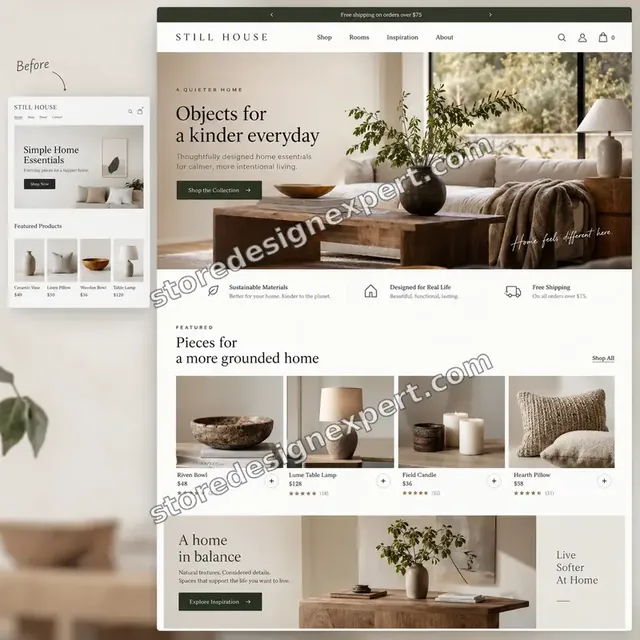
Home decor store design
Home decor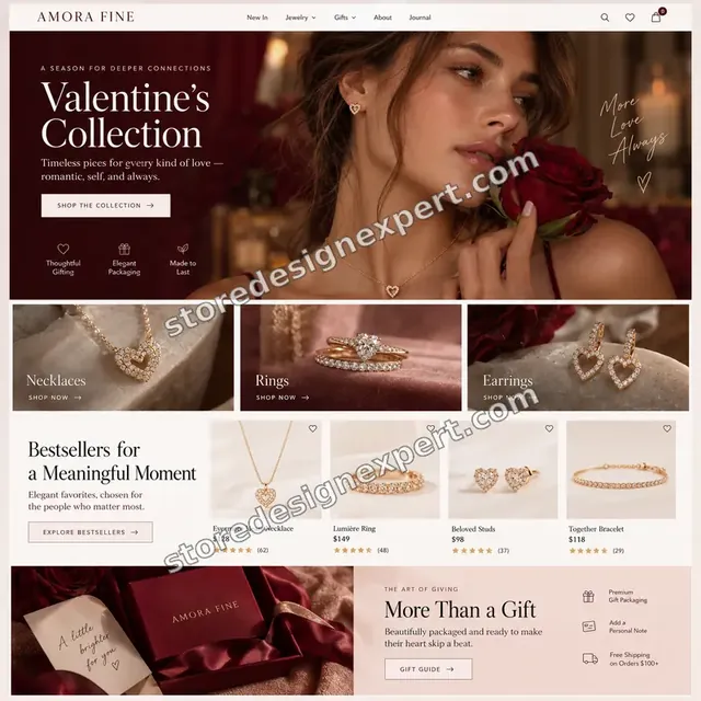
Jewelry store design
Jewelry
Coffee store design
Coffee
Specialty coffee store design
Specialty coffeeProcess and timeline
How Your Colour Palette Is Delivered, Start to Finish
Six clear steps. Nothing goes live without your approval, and your calculator choices set how long each one runs for the colour palette.
- 1
Brief and asset review
You describe what good colour palette looks like for your store and customers. We write the plan down.
- 2
Choose how we get access
A collaborator request will do, as will working in our Partner account followed by a transfer. We never ask for your password during the colour palette job.
- 3
Agree the feeling and look at your market
We discuss what the colours should say, look at the palettes your competitors use and collect examples you like, then agree a direction.
- 4
Build, test contrast and apply to the theme
We build the palette, test text and button pairs for contrast, write each colour's role and enter the colours in your theme settings.
- 5
Compare the result with the brief and with your store
Every colour palette item is compared with the brief, and anything that lands in your store is checked across devices. We fix what is off before Brand Colour Palette Design reaches you.
- 6
Deliver and hand over
We hand over the colour palette after sign-off with files and written notes. Revisions are included and you can stop at any point.
Compare your options
Free tool alone, Gig marketplace, Generalist studio or Our Colour Palette Service?
Four usual ways to choose brand colours. This comparison shows who tests contrast, writes roles and applies the palette.
| What matters | Free tool alone | Gig marketplace | Generalist studio | Store Design Expert |
|---|---|---|---|---|
| Chosen for feeling and market | Taste alone | Sometimes | Sometimes | Yes |
| Contrast tested for text and buttons | No | Rarely | Sometimes | Yes |
| Roles and proportions written down | No | No | Extra cost | Yes |
| Applied to your theme settings | Manual guesswork | Rarely | Extra cost | Yes |
| Price known before work begins | Cheap but open-ended | Yes | Quote only | Yes |
| Shopify store and checkout expertise | Learning | Varies | General | Yes |
| Two structured revision rounds | No | Varies | Extra cost | Yes |
| Source files and notes delivered in writing | No | Rarely | Sometimes | Yes |
Inside every project
What Protects Your Store and Your Budget During Brand Colour Palette Design
Six habits keep your store, your brand and your budget safe while we handle the colour palette.
Colour meaning varies by market
Colours carry different associations in different places, so you confirm that choices suit the markets you sell in.
Least access needed
We ask only for the access your colour palette needs, through Shopify's own sharing tools where a store is involved, and remove it when we finish.
Working files are yours
Final and working files for your colour palette are handed over, so another person could use them later.
Checked before you look
Every colour palette item is checked against the brief first, so your review covers taste and wording, not faults.
No promised sales
We make colour palette to help shoppers decide, and we never promise revenue, rankings or reach.
Rights respected
We only use images, fonts, music and text you own or that are properly licensed in your colour palette, and we say which.
Interactive price calculator
Build Your Colour Palette Package
Choose a package, then tell us about your volume, your colour palette needs and how soon you want it. The fixed price and delivery window update with every click.
Request a custom quote
Very large volumes, several brands or stores, rush schedules and unusual formats for colour palette are scoped separately and quoted at a fixed price.
Request a QuoteChanged your mind? Choose Palette Studio Essential, Palette Studio Plus or Palette Studio Premier above to return to the instant calculator.
Packages and comparison
Colour Palette Package Comparison
Line-by-line detail of what each package covers, useful when choosing between a light pass and a full colour palette service.
| What is included | Palette Studio Essential $190 | Palette Studio Plus $390Recommended | Palette Studio Premier $790 |
|---|---|---|---|
| Palette of five tones | Included | Included | Included |
| Colour codes for screen | Included | Included | Included |
| Contrast checks for text | Included | Included | Included |
| Role for each colour | Included | Included | Included |
| One-page palette sheet | Included | Included | Included |
| Two palette directions | Not included | Included | Included |
| Colour system for interface elements | Not included | Included | Included |
| Accessible text and button pairs | Not included | Included | Included |
| Theme colour settings applied | Not included | Included | Included |
| Print values for packaging | Not included | Included | Included |
| Three palette directions | Not included | Not included | Included |
| Seasonal and sale accents | Not included | Not included | Included |
| Dark-mode and background notes | Not included | Not included | Included |
| Colour guide with proportions | Not included | Not included | Included |
| Source files handed over | Not included | Not included | Included |
| Typical delivery | 2 to 4 days | 4 to 7 days | 7 to 11 days |
The calculator above gives the exact price and delivery estimate for your Brand Colour Palette Design order, and that is what you pay.
Why Store Design Expert
Color Palettes for Branding: Why Brands Choose Us
Anyone can pick a nice blue. Store owners hire us for the market review, the contrast testing and the theme application that make colours work on a screen.
We test readability, not just taste
Every text and button pair is checked for contrast.
Daily work on Shopify themes
Theme colour settings and sections are everyday material for us.
Rated 4.9+ by verified clients
These reviews come from verified Store Design Expert clients, in their own words, and your colour palette follows the same process.
Prices you can plan around
Every package, option and extra has a visible price, sized by volume, detail and speed for your colour palette.
No account manager in between: you reach the person doing the work
You write to the person handling your colour palette, not a ticket queue.
Experience since 2015
More than 450 Shopify stores launched means few catalog, content or launch problems are new to us, colour palette included.
What we need to get started
What We Need Before We Start Your Colour Palette
Three ways to give access, then a short list of facts about your colour palette.
Your brand feeling
Describe how the brand should feel and who it serves.
Colours you like
Share brands, stores or products with colours that appeal.
Existing colours
Send current codes or a logo that carries colour.
Accept our collaborator request
Tell us your store address and say yes to our access request. The owner can grant what we need for your colour palette and remove us in one click.
Taking over existing work? That is fine
Say what is already there and who made it. We review your colour palette first and agree what to keep.
Or share a restricted staff login
A staff account with limited permissions works too for colour palette, though the collaborator route is easier to revoke.
Owner passwords and card details are never requested for your colour palette. Everything runs through Shopify's built-in access settings, and our access ends with the project.
Testimonials
What Store Owners Say Before You Order Brand Colour Palette Design
Verified Store Design Expert clients describe the brief, the work and the handover in their own words, and your colour palette follows the same path.
Verified
Store Design Expert delivered an outstanding website development experience! Their professionalism and attention to detail exceeded my expectations, and their proactive communication kept everything running smoothly. Truly impressed by their deep understanding and dedication.
WG
Warren G.United States
Verified
Very impressed with the build-out. My store is ready to get started, and I am sure I will reach out for edits down the road, but this is everything I could ask for to get the party started. Thanks again, and I will be in touch for future projects.
DH
Dale H.United States
Verified
Very quick and detailed work! Store Design Expert does exactly what you want, in a very professional manner.
LF
Lena F.Germany
Verified
Store Design Expert did an outstanding job with top-notch professionalism on my website project. Everything was delivered quickly without compromising quality. I could not have asked for better!
JM
Jason M.United States
Verified
The website development work was nothing short of professional, with top-notch quality. Their exceptional level of cooperation made the collaboration seamless and enjoyable. Highly recommend working with Store Design Expert!
JC
Jeremy C.United States
Verified
Super great to work with, and super fair!
RO
Robert O.United States
Verified
The website development work was truly impressive. Their attention to detail and ability to exceed expectations made the project a success. Working with them was a breeze, thanks to quick responsiveness and a willingness to go above and beyond.
KD
Kevin D.United States
Verified
Store Design Expert was very knowledgeable about what I needed done to fix my Shopify store and how to improve the store layout. The project was completed very quickly, and I will definitely use them for support as my business grows.
ST
Samuel T.United States
Verified
Very satisfied with the work. Most importantly, Store Design Expert responded promptly to my questions and concerns. Thank you!
KB
Kyle B.United States
Related searches
What People Search For Before Ordering Brand Colour Palette Design
Owners reach this page from different searches. Here is how the common ones relate to Brand Colour Palette Design.
People who look up “brand color palette design for shopify stores”, “brand color palette ideas” or “how to choose brand color palette” usually want Brand Colour Palette Design; the calculator above shows the price and delivery estimate before you commit.
If you searched for “best brand color palettes”, “brand color palette examples” or “color palette for luxury brand”, Brand Colour Palette Design is the work that answers it.
“clothing brand color palette”, “brand guide color palette” or “color palette brand guidelines” all point to the same job, which Brand Colour Palette Design covers from start to finish.
If you searched for “color palette for food brand”, “how to build a brand color palette” or “brand colour palette generator”, Brand Colour Palette Design is the work that answers it.
FAQ
Color Palettes for Branding: Your Questions Answered
Answers on cost, timing, access, files and what happens after delivery for colour palette.
How long does colour palette design take?
Most jobs take 2 to 11 working days, depending on package, directions and how far the system goes. An estimate is shown in the calculator first, and payment comes after.
Will the colours be accessible?
We test text and button pairs against recognised contrast guidance and tell you where a pair falls short, so readable pages are built in from the start.
What do you need from me to start Brand Colour Palette Design?
Send your brand feeling, a few colour examples you like and a collaborator request for your store. We start by looking at your market's palettes.
How much does Brand Colour Palette Design cost?
Brand Colour Palette Design starts at $190. With every option switched on the total reaches $2,530.
What packages are available for Brand Colour Palette Design?
Brand Colour Palette Design comes in 3 packages: Palette Studio Essential at $190 (2 to 4 working days), Palette Studio Plus at $390 (4 to 7 working days) and Palette Studio Premier at $790 (7 to 11 working days).
What does Palette Studio Essential include for Brand Colour Palette Design?
A palette of five tones built around your brand feeling, with codes, contrast checks and clear roles for each colour. It includes: Palette of five tones; Colour codes for screen; Contrast checks for text; Role for each colour; One-page palette sheet. Palette Studio Essential costs $190 and takes 2 to 4 working days.
What does the Brand Colour Palette Design calculator ask me?
When you order Brand Colour Palette Design you pick a package and then answer 4 short questions in the calculator: how many palette directions (One direction, Two directions, Three directions); how far should the system go (Core palette, Plus interface colours, Plus seasonal and sale accents); who applies it to the store (You apply it, We apply it to the theme, We apply it and style key sections); how soon do you need it live (Standard, Sooner, Fastest).
Are there optional extras for Brand Colour Palette Design?
Extras available with Brand Colour Palette Design: Dark-mode palette (+$180), Packaging colour test (+$160), Seasonal accent kit (+$150), Palette one-pager (+$90), Email colour set (+$120) and Recorded palette walkthrough (+$90).
What if Brand Colour Palette Design is not quite what I need?
For Brand Colour Palette Design work outside the packages, choose Request a custom quote. We put the scope in writing and give you one fixed price before we begin.
Ready when you are
Color Palettes for Branding: Order Your Package
Choose a package, watch the fixed price settle and have a team that has launched 450+ Shopify stores choose, test and apply your brand colours before a shopper sees your store.
Fixed price · Two revision rounds · Files handed over